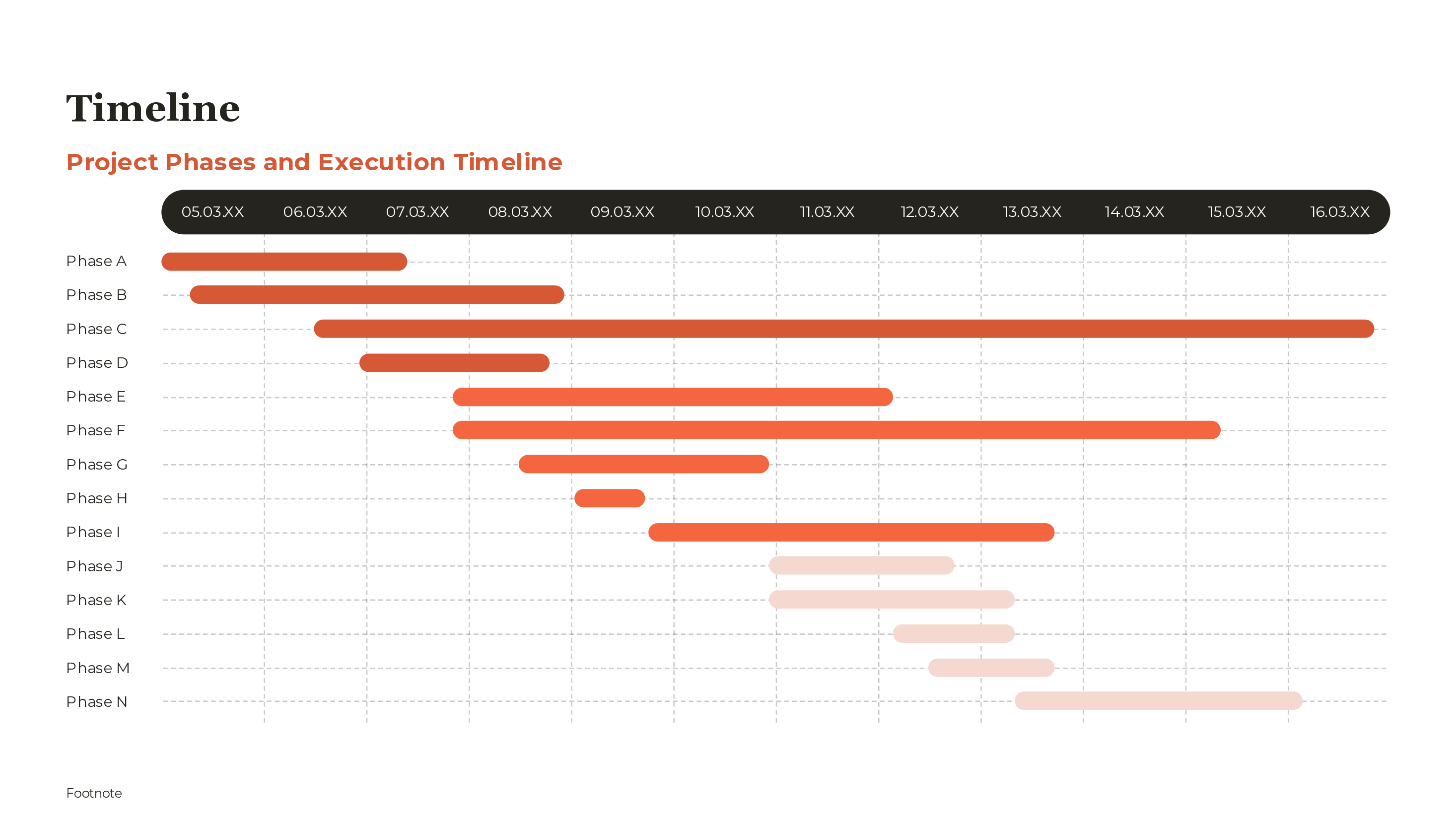
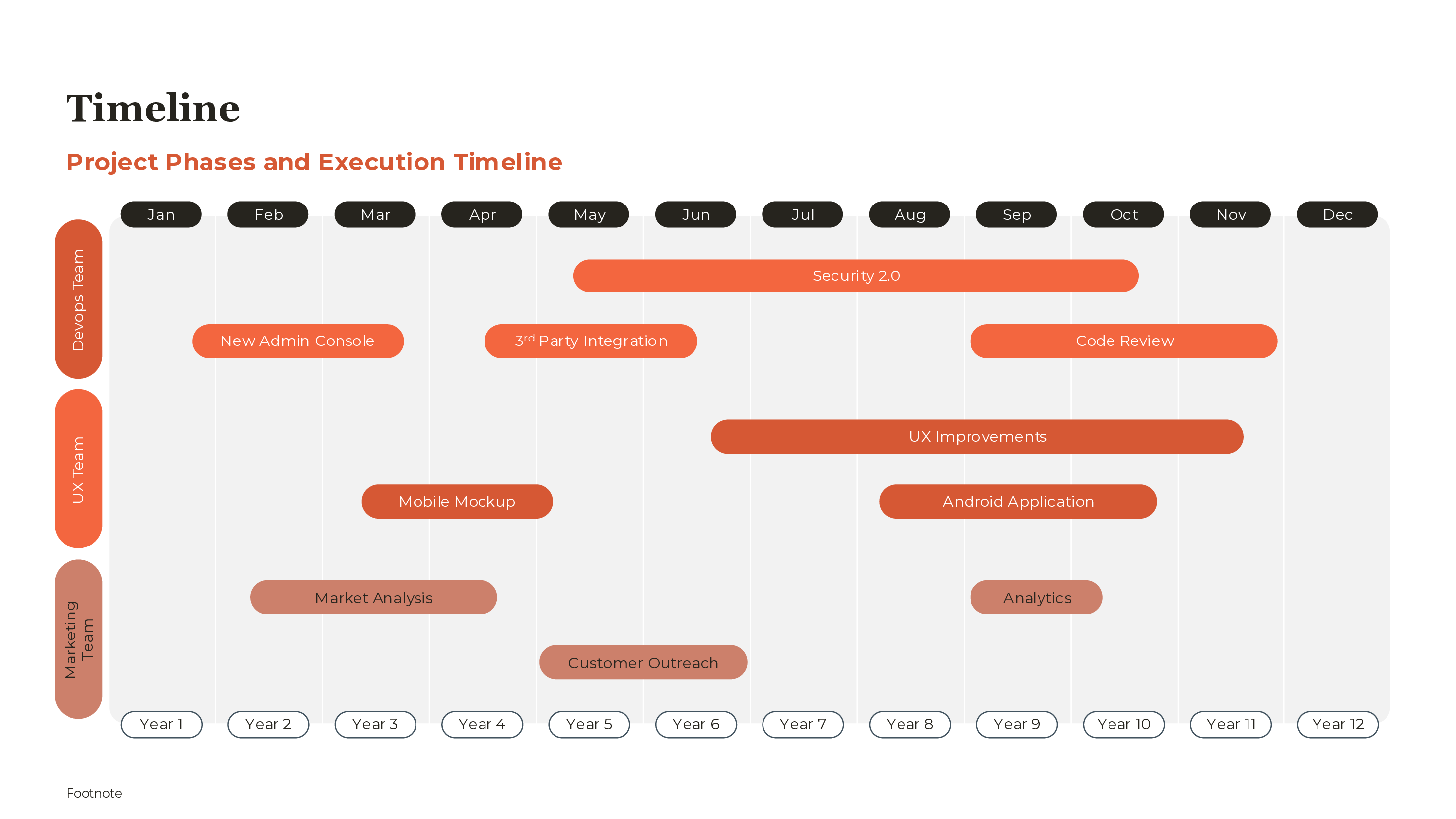
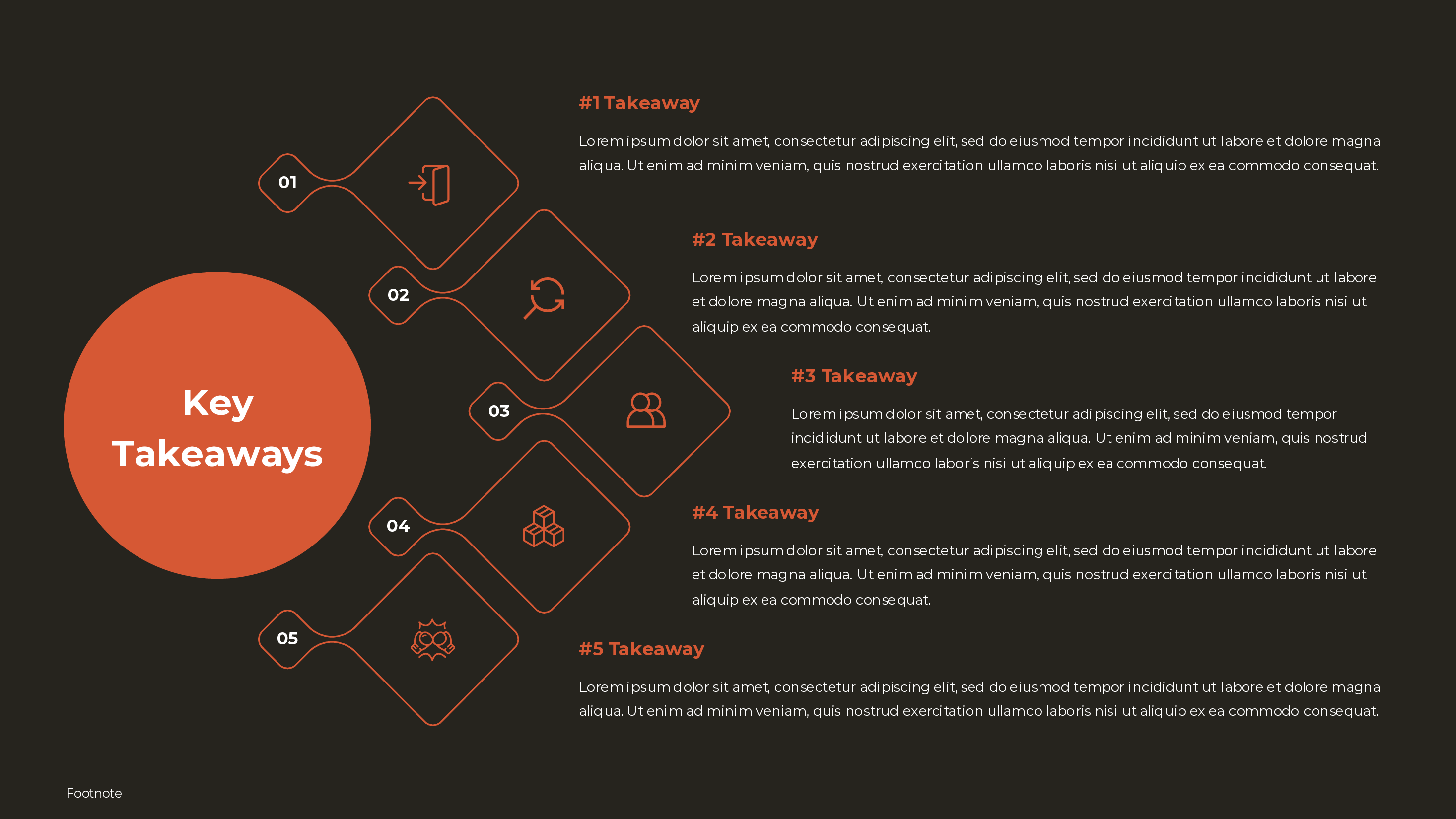
Includes 4 slide variations
Free KPI Dashboard PowerPoint Template
Part of our 143 template library. Install the free add-in to use it directly in PowerPoint.
What's Included
How to Use This Template
- 1Select 4-6 KPIs that matter most to your audience
- 2Choose visualization type for each metric
- 3Add current values and targets
- 4Include trend direction (up/down arrows)
- 5Use RAG status for quick health assessment
- 6Add brief commentary on outliers or concerns
When to Use This Template
- Monthly business reviews
- Board reporting packages
- Sales performance updates
- Operations scorecards
- Marketing campaign tracking
- Executive dashboards
Common Mistakes to Avoid
- Including too many KPIs (focus on 4-6 key ones)
- Missing targets or benchmarks for comparison
- Using inconsistent time periods
- Not showing trend direction
- Forgetting to explain why metrics changed
Use This Template in PowerPoint
Get the KPI Dashboard Template and 142 other consulting-grade templates with the free Deckary add-in.
Get Started FreeFree plan available. No credit card required.
KPI Dashboard Template FAQs
Common questions about the kpi dashboard template
Related Templates
Turning Metrics Into Decisions
A KPI dashboard transforms raw metrics into actionable insights. The goal isn't to display data—it's to enable decisions. When an executive looks at your dashboard, they should immediately know: Are we on track? What needs attention? What's improving or declining?
Our PowerPoint KPI dashboard template provides a professional layout for presenting key performance indicators to executives and stakeholders. It includes multiple visualization options optimized for quick scanning and clear communication. Feed KPIs from a Stackrows KPI dashboard template to keep your source data organized.
The Anatomy of an Effective KPI Dashboard
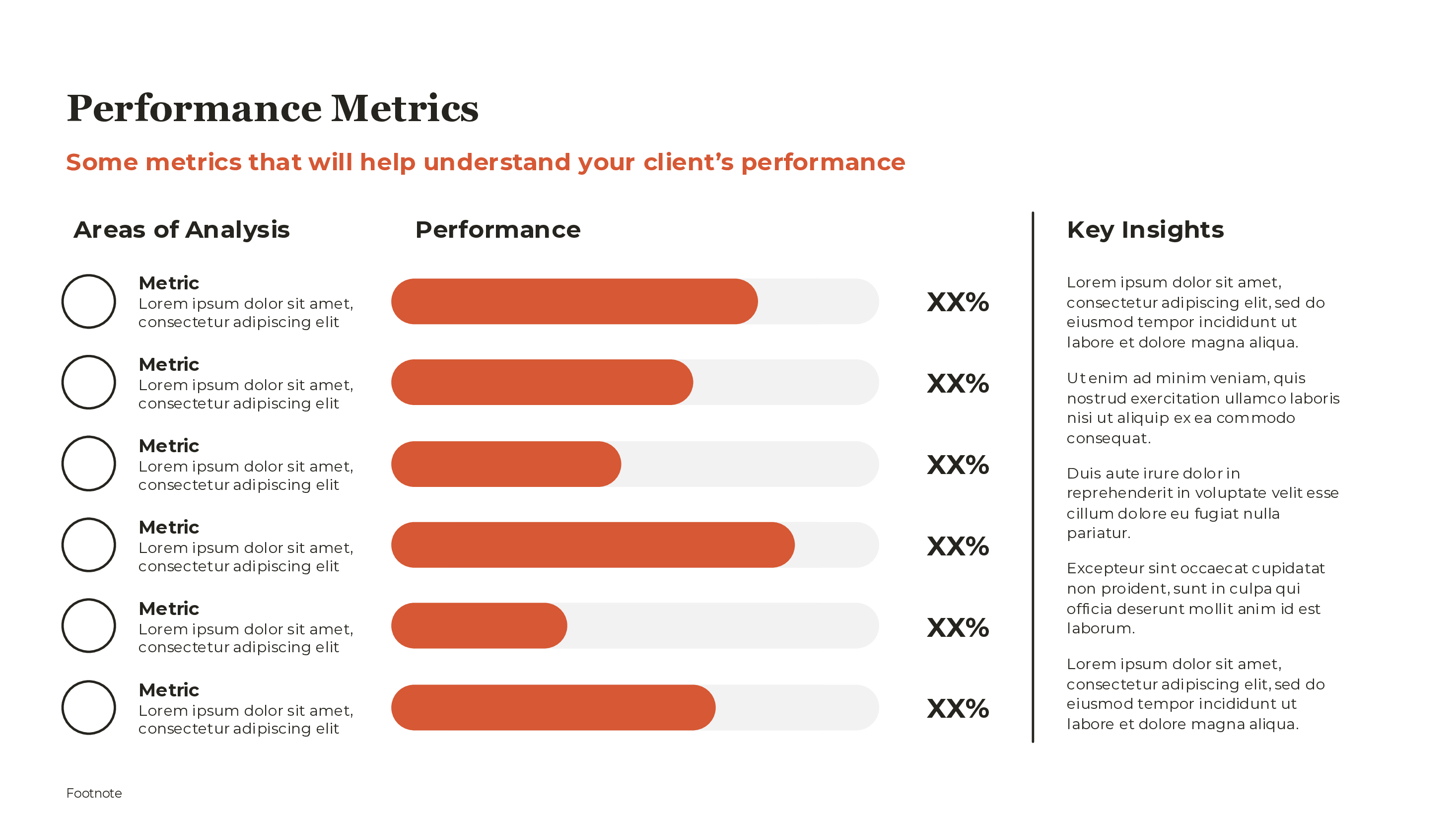
Metrics selection: The most important decision is which metrics to include. Less is more—4-6 KPIs per slide is the sweet spot. Each KPI should:
- Be directly tied to business objectives
- Be actionable (you can influence it)
- Have a clear target or benchmark
- Be understood by your audience
Visual hierarchy: Your most important metric should be most prominent—larger, positioned top-left, or given more visual weight. Secondary metrics support the primary message.
Comparison context: A number without context is meaningless. Is 85% good or bad? Every KPI needs comparison: target, prior period, benchmark, or trend direction. Our guide on financial projections slides explains how to present financial KPIs with the right context.
Status indicators: RAG colors (Red/Amber/Green) provide instant health assessment. But don't let colors replace commentary—explain why metrics are red or green.
Choosing Visualization Types
Different metrics call for different visualizations:
Single large number with trend arrow: Best for your primary KPI. Shows the current value prominently with direction indicator.
Gauge/speedometer: Good for metrics with a clear target range. The needle position shows how close you are to the target. Use sparingly—more than one gauge per slide becomes cluttered.
Progress bars: Ideal for showing completion percentage or attainment against goal. Works well for quota attainment, project completion, or target achievement.
Sparklines: Tiny line charts that show trend over time in minimal space. Add them next to numbers to show direction without taking much real estate.
Comparison tables: When you need to show multiple metrics with consistent formatting—actual vs. target, this period vs. last period.
Bullet charts: A compact alternative to gauges. Shows actual value, target, and performance bands in a horizontal bar format.
KPI Selection: What to Measure
The right KPIs depend on your function and audience. Here are common patterns:
Executive dashboard:
- Revenue (actual vs. plan)
- Profitability metrics (gross margin, EBITDA)
- Customer metrics (NPS, churn, CAC)
- Operational efficiency (cost per unit, cycle time)
Sales dashboard:
- Revenue attainment vs. quota
- Pipeline coverage ratio
- Win rate
- Average deal size
- Sales cycle length
Marketing dashboard:
- Lead generation volume
- Marketing-sourced pipeline
- Customer acquisition cost (CAC)
- Website traffic and conversion
- Campaign ROI
Operations dashboard:
- Throughput or capacity utilization
- Quality metrics (defect rate, first-pass yield)
- Cycle time or lead time
- On-time delivery rate
- Cost per unit
Common Dashboard Mistakes
Too many metrics: If everything is important, nothing is. Trying to fit 15 KPIs on one slide means none get adequate attention. Prioritize ruthlessly.
No comparison context: "Revenue: $5.2M" tells you nothing. "Revenue: $5.2M (↑12% vs. plan)" tells a story. Every metric needs a comparison.
Inconsistent time periods: Comparing monthly revenue to quarterly pipeline is confusing. Align time periods or clearly label when they differ.
All green, always: If your dashboard is always green, either you're exceptional or your targets are too soft. Review whether targets are appropriately challenging.
Data without explanation: Numbers prompt questions. Be prepared to explain why metrics moved and what's being done about off-track indicators.
Stale data: Nothing undermines credibility faster than presenting outdated numbers. Update immediately before each presentation.
Building Commentary That Adds Value
The best KPI dashboards include brief commentary that interprets the data:
For green metrics: "Revenue +12% driven by enterprise segment growth in EMEA."
For amber metrics: "Pipeline coverage at 2.3x vs. 3.0x target. Sales team accelerating prospecting in target accounts."
For red metrics: "Churn increased to 4.2%. Root cause: product gaps in enterprise segment. Roadmap adjusted to address in Q2."
Commentary should answer three questions:
- What happened? (The data shows...)
- Why did it happen? (Root cause)
- What are we doing about it? (Action, if needed)
Dashboard Design Best Practices
Consistent formatting: All KPI cards should use the same layout, fonts, and color scheme. Inconsistency looks sloppy and makes scanning harder.
Clear labeling: Every metric needs a label. Don't make the audience guess what "4.2%" refers to. Include the metric name and time period.
Whitespace: Dashboards need breathing room. Cramped designs are hard to read and look unprofessional. Better to show fewer metrics with adequate spacing.
Mobile consideration: If your dashboard will be viewed on phones or in print, test at reduced size. Some visualizations don't scale down well.
Dashboards vs. Reports
KPI dashboards and detailed reports serve different purposes:
Dashboard:
- One-page summary
- 4-6 key metrics
- Visual emphasis
- For quick status check
- Used in live meetings
Report:
- Multi-page detail
- Comprehensive metrics
- Tables and analysis
- For deep dives
- Often read asynchronously
Use the dashboard for steering committee meetings and executive reviews. Keep detailed reports in appendix or as separate documents for those who want to go deeper. For a complete guide to structuring these meetings, see our quarterly business review template.
For related templates, see our executive summary template and project plan template. Deckary's AI Slide Builder can generate KPI dashboard layouts from a description of your metrics.
Complete guide
Related articles
Related features