Deloitte Presentation Template: Recreating the Big 4 Style in PowerPoint
Learn how to recreate Deloitte's presentation style in PowerPoint. Master their green brand colors, slide layouts, and professional formatting standards.
Deloitte presentations have a distinctive visual language: precise lime-green accents (#86BC25), generous white space, and data visualizations that prioritize clarity over complexity. These elements make Deloitte slides instantly recognizable among Big 4 firms—and signal professionalism to clients familiar with their work.
Unlike MBB firms that focus purely on analytical structure, Deloitte balances branded consistency with consulting rigor. Their TIM framework (Topic, Intention, Message) ensures every slide communicates clearly while maintaining the polished aesthetic Fortune 500 clients expect.
This guide breaks down how to recreate Deloitte's presentation style—the colors, fonts, layouts, and formatting patterns—whether you work at Deloitte or want to achieve their level of visual polish.
What Defines Deloitte's Presentation Style#
Deloitte sits in an interesting position in consulting. Unlike MBB firms (McKinsey, BCG, Bain), Deloitte is part of the Big 4 accounting firms alongside PwC, EY, and KPMG. This dual identity—rooted in audit but competing in strategy consulting—shapes their presentation philosophy.
Deloitte presentations prioritize three things:
- Brand consistency: Templates are tightly controlled to maintain the Deloitte look across thousands of professionals globally
- Clarity over complexity: Each slide delivers one message with supporting visuals that reinforce the point
- Professional restraint: Clean layouts with strategic color use—never flashy, always polished
Where BCG presentations lean heavily visual with bold callouts, and McKinsey builds structured logical arguments, Deloitte strikes a balance. Their slides are data-driven but not overwhelming, branded but not decorative.
The result is a style that feels corporate and credible—exactly what you'd expect from a firm advising Fortune 500 executives on transformation and risk.
The Deloitte Color Palette#
Deloitte's visual identity centers on one instantly recognizable element: the green dot.
The Signature Green#
Deloitte Green is the firm's defining brand color:
| Color | Hex Code | RGB | Usage |
|---|---|---|---|
| Deloitte Green | #86BC25 | 134, 188, 36 | Accents, emphasis, logo |
| Black | #000000 | 0, 0, 0 | Primary text, headers |
| White | #FFFFFF | 255, 255, 255 | Backgrounds |
| Gray (supporting) | #7D7D7D | 125, 125, 125 | Secondary text, chart elements |
The story behind the green matters. In 2003, Deloitte rebranded after abandoning plans to sell their consulting practice. The original design tested fuchsia, yellow, orange, and bronze before settling on lime-green. The color was chosen because it represents growth, wealth, and progress—values aligned with Deloitte's advisory mission.
How to Use the Green#
The rules Deloitte follows:
- Use green sparingly for emphasis, never as a dominant slide color
- Apply green to highlight key data points, not entire charts
- Reserve green for the most important takeaways
- Never use green text on light backgrounds (contrast issues)
In practice:
On a slide showing revenue by segment, seven bars might be gray while one green bar draws attention to the segment driving growth. The green says "look here"—everything else is context.
Extended Palette for Data Visualization#
When you need more colors for charts, expand thoughtfully:
| Color | Hex Code | Use Case |
|---|---|---|
| Deloitte Green | #86BC25 | Primary emphasis, positive data |
| Dark Blue | #0076A8 | Primary data series |
| Medium Gray | #7D7D7D | Secondary data, neutral |
| Light Blue | #00A3E0 | Supporting data series |
| Dark Gray | #4D4D4D | Labels, axis text |
| Red | #C4262E | Negative trends, warnings |
Key principle: Maximum three to four colors per chart. If you need more, the chart is too complex—simplify the message or split into multiple slides.
Typography Standards#
Deloitte presentations rely on clean, accessible fonts that work across platforms and printing.
Font Choices#
According to industry discussions, Deloitte commonly uses Verdana as their standard font. However, Arial and Calibri are also widely accepted in professional consulting contexts and offer similar readability.
Practical recommendations:
| Element | Font | Size | Weight |
|---|---|---|---|
| Action titles | Verdana/Arial | 18-20pt | Bold |
| Subtitles | Verdana/Arial | 14-16pt | Regular |
| Body text | Verdana/Arial | 10-12pt | Regular |
| Chart titles | Verdana/Arial | 12-14pt | Bold |
| Chart labels | Verdana/Arial | 8-10pt | Regular |
| Source citations | Verdana/Arial | 8pt | Regular/Italic |
Typography Rules#
Do:
- Use one font family throughout the entire deck
- Maintain consistent sizes for each element type across all slides
- Apply bold for emphasis, not color or italics
- Left-align body text for readability
- Keep line spacing at 1.15-1.3x
Don't:
- Mix fonts (Arial titles with Calibri body)
- Reduce font size to squeeze in more content
- Use decorative fonts for any element
- Center-align body paragraphs (headers only)
- Italicize entire sentences for emphasis
Deloitte Slide Structure#
Every Deloitte slide follows a predictable anatomy designed for clarity and rapid comprehension.
The Standard Slide Layout#
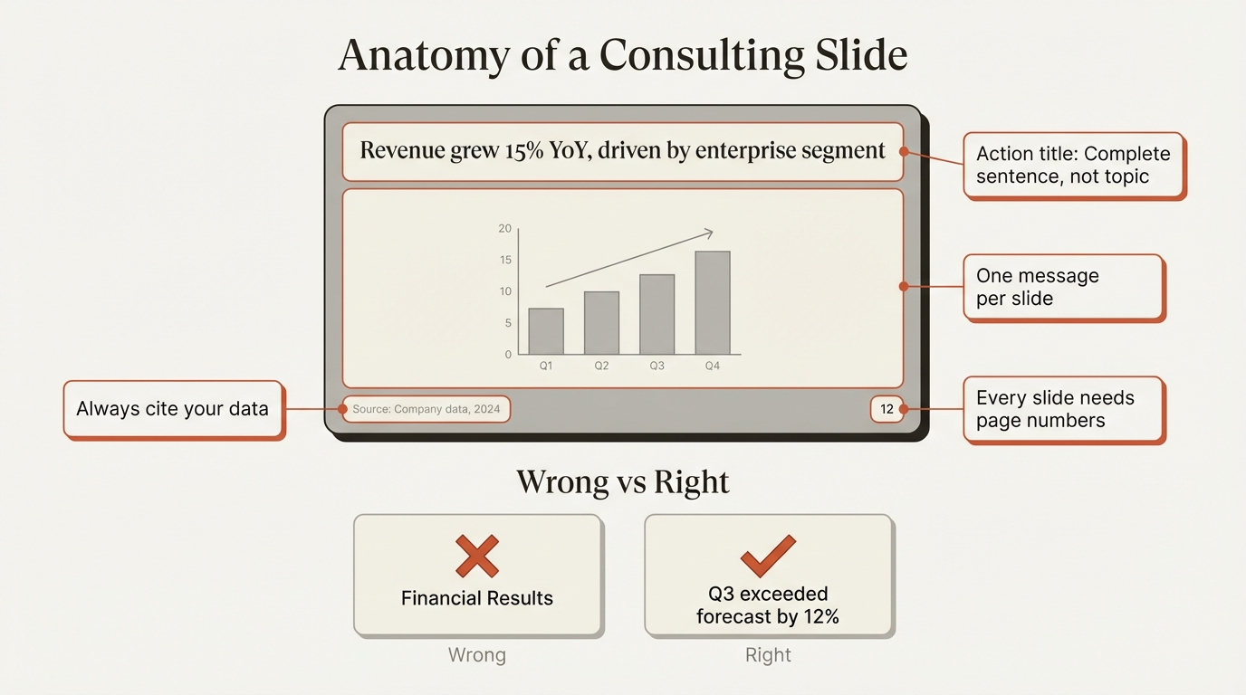
Header zone (top 15-20% of slide):
- Action title: One-line statement of the key takeaway
- Optional subtitle: Additional context or quantification
Content zone (middle 65-75%):
- Single visual or content block
- Chart, table, framework, or structured text
- Clear visual hierarchy directing attention
Footer zone (bottom 5-10%):
- Source citation (required for any data)
- Page number
- Optional: date, confidentiality marking
The TIM Framework#
Deloitte uses the TIM framework to structure each slide:
T - Topic: What is this slide about?
- Defined by the action title
- One topic per slide, never more
I - Intention: What do you want the audience to do?
- Understand something new
- Agree with a conclusion
- Take specific action
M - Message: What is the actionable takeaway?
- Stated explicitly in the title
- Supported by the visual content
- Answers "so what?"
Example application:
| Element | Content |
|---|---|
| Topic | Consumer privacy regulation costs |
| Intention | Persuade audience that costs will rise |
| Message | "Consumer businesses face 3x higher compliance costs under new privacy regulations" |
| Action Title | Consumer businesses may have historically had lower compliance costs; privacy regulations will change that dynamic |
This title works because it states the full takeaway—readers don't need to interpret the chart to understand the point.
Action Titles: The Deloitte Way#
Like all top consulting firms, Deloitte requires action titles—not topic titles. But Deloitte's approach has distinctive characteristics.
What Makes a Deloitte Action Title#
Deloitte action title characteristics:
- States a complete insight as a sentence
- Often includes context before the main point
- Uses semicolons to connect related thoughts
- Provides enough detail that the chart becomes proof, not the message
| Topic Title (Wrong) | Deloitte Action Title (Right) |
|---|---|
| Compliance Costs | Consumer businesses face lower compliance costs today; privacy regulations will increase costs 3x |
| Market Growth | European market growing at 8% annually, outpacing North America by 2:1 |
| Customer Satisfaction | NPS declined 15 points post-price increase, concentrated in price-sensitive segments |
| Cost Reduction | Fixed costs reduced 22% through automation, exceeding $45M annual savings target |
| Competitive Position | We outperform incumbents on 5 of 7 purchase criteria, weak only in brand recognition |
Deloitte vs. Other Firms#
| Firm | Action Title Style |
|---|---|
| Deloitte | Contextual, often two-part with semicolon, explanatory |
| McKinsey | Structured, comprehensive, logically complete |
| BCG | Punchy, quantitative, maximum impact |
| Bain | Clean, direct, balanced |
Deloitte example: "Consumer businesses may have historically had lower compliance costs than other major industries; however, privacy regulations will likely change that dynamic"
BCG equivalent: "Privacy regulations will 3x compliance costs for consumer businesses"
McKinsey equivalent: "New privacy regulations will significantly increase compliance costs for consumer businesses, which historically paid less than other industries"
Deloitte titles tend to acknowledge nuance and context. They're less aggressive than BCG, less structured than McKinsey, but highly informative.
Continue reading: OKR Template PowerPoint · Bullet Charts in PowerPoint · Duplicate Shortcut in PowerPoint
Create slides 2x faster with Deckary
Charts, keyboard shortcuts, icons, templates and more. The only PowerPoint add-in you need.
Data Visualization Standards#
Deloitte presentations are data-driven, using charts and visualizations to prove points rather than just illustrate them.
Chart Selection Guidelines#
| To Show | Recommended | Avoid |
|---|---|---|
| Change over time | Line chart, Column chart | Area chart, 3D charts |
| Comparison | Bar chart, Grouped bars | Pie chart, Radar chart |
| Composition | Stacked bar, 100% stacked | 3D pie, Donut chart |
| Distribution | Histogram, Box plot | Excessive scatter plots |
| Process flow | Gantt chart, Timeline | Complex Sankey diagrams |
| Relationship | Scatter plot, Bubble chart | 3D visualizations |
| Part-to-whole | Waterfall, Mekko chart | Multiple pie charts |
The Deloitte Chart Style#
Visual characteristics:
- Clean lines without excessive gridlines
- Direct labels on data points (avoid legends when possible)
- Strategic use of color to highlight key data
- Industry icons below charts to accelerate comprehension
- Generous white space around chart elements
One distinctive Deloitte technique: Deloitte sometimes uses unconventional chart shapes—like pyramid shapes instead of standard columns—when the message is about relative magnitude rather than precise comparison. This works because the visual reinforces the insight without requiring exact data reading.
Chart Formatting Checklist#
- Chart title describes the data, not the insight (title carries the insight)
- Maximum 5-7 data points for clarity
- Direct labels on bars/lines when space allows
- Legend only when necessary, positioned to minimize eye movement
- Gridlines minimal or removed entirely
- Source citation below every chart
- Green (#86BC25) used only for emphasis points
Building Consulting Charts#
PowerPoint's native chart tools can produce clean visualizations, but consulting-grade charts—especially waterfalls and Mekkos—require specialized tools.
Deckary ($49-119/year) and think-cell ($299/year) both automate these chart types with Excel data linking, saving hours of manual construction. For Deloitte-style presentations where data visualization is central, these tools pay for themselves quickly.
Comparing Big 4 Presentation Styles#
While the Big 4 share fundamental consulting standards, each firm has distinctive visual characteristics.
Big 4 Style Comparison#
| Element | Deloitte | PwC | EY | KPMG |
|---|---|---|---|---|
| Primary brand color | Green (#86BC25) | Orange (#DC6900) | Yellow (#FFE600) | Blue (#00338D) |
| Secondary color | Black | Black/Gray | Black | White |
| Visual density | Balanced | Chart-heavy | Balanced | Text-forward |
| Typography style | Clean, Verdana-based | Modern, proprietary | Structured, consistent | Corporate, formal |
| Layout preference | Generous white space | Compact, efficient | Clean, branded | Structured, hierarchical |
| Chart emphasis | Strategic color use | Bold color coding | Systematic approach | Detailed annotations |
Big 4 vs. MBB#
| Aspect | Big 4 (Deloitte, PwC, EY, KPMG) | MBB (McKinsey, BCG, Bain) |
|---|---|---|
| Brand emphasis | Strong branded templates | Minimal branding |
| Slide volume | Often larger decks (50-100+ slides) | Focused decks (30-50 slides) |
| Visual style | Corporate, polished | Analytical, insight-driven |
| Text density | Moderate | Varies (BCG light, McKinsey heavy) |
| Template control | Centralized, strict | Firm guidelines, flexibility |
When to Use Deloitte Style#
Deloitte style works best when:
- Presenting to corporate audiences expecting branded professionalism
- Delivering transformation or risk-focused recommendations
- Working in industries where Deloitte has strong presence (financial services, technology, healthcare)
- Needing to balance analytical depth with visual clarity
Consider MBB styles when:
- Presenting pure strategy recommendations
- Audience values insight density over brand consistency
- Working with private equity or investment contexts
- Need maximum analytical credibility
Common Mistakes to Avoid#
These errors immediately signal unfamiliarity with Deloitte standards.
Mistake 1: Wrong Green#
Problem: Using any green that isn't #86BC25
Why it matters: Deloitte's specific lime-green is instantly recognizable. A forest green or emerald says "trying to look like Deloitte" rather than "familiar with Deloitte."
Fix: Save #86BC25 to your PowerPoint color palette. If recreating the style externally, use this exact shade for accents.
Mistake 2: Overusing the Green#
Problem: Green headers, green text boxes, green backgrounds
Why it matters: Deloitte uses green sparingly—the dot at the end of their logo, key emphasis points in charts. Overuse makes slides look garish and undermines the restraint that defines professional presentations.
Fix: Limit green to 1-2 elements per slide maximum. When in doubt, use less.
Mistake 3: Topic Titles Instead of Action Titles#
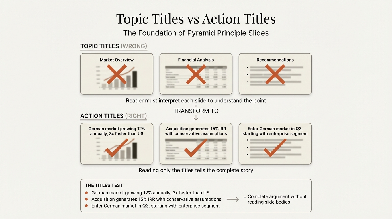
Problem:
- "Q3 Revenue Analysis"
- "Customer Feedback"
- "Market Overview"
Why it matters: Topic titles force readers to study the chart to understand the point. Action titles tell them the conclusion immediately.
Fix: Every title should be a complete sentence stating an insight. If your title doesn't include a verb and a conclusion, rewrite it.
Mistake 4: Cramming Multiple Messages#
Problem: One slide covering market size, growth rates, and competitive dynamics
Why it matters: The TIM framework requires one topic, one intention, one message per slide. Multiple messages create cognitive overload and unclear takeaways.
Fix: Split into separate slides. Each slide should answer one "so what?"
Mistake 5: Inconsistent Formatting#
Problem:
- 18pt titles on slides 1-5, then 20pt on slides 6-10
- Different bullet styles throughout
- Varying margins and spacing
Why it matters: Inconsistency signals carelessness. In consulting, attention to detail is assumed—formatting errors raise questions about analytical rigor.
Fix: Use master slides. Check alignment with PowerPoint's guides. Never deviate from the template.
Mistake 6: Missing Sources#
Problem: "Market growing at 15% CAGR" with no attribution
Why it matters: Every data point needs a source. Executives will ask "where did this come from?" Unsourced data destroys credibility.
Fix: Add source citations below every chart. Format: "Source: [Data source] (Year); Deloitte analysis"
How to Recreate the Deloitte Style#
You don't need to work at Deloitte to apply their principles. Here's how to build Deloitte-style presentations.
Step 1: Set Up Your Template#
Create a master template with:
- Deloitte Green (#86BC25) in your color palette
- Black (#000000) as primary text color
- Gray (#7D7D7D) for secondary elements
- Verdana or Arial as your font family
- Consistent margins (0.5-0.75 inches)
- Fixed title position across all slide layouts
Step 2: Build Your Storyline First#
Before opening PowerPoint, structure your argument:
- Write your recommendation in one sentence
- List 3-5 supporting arguments
- Under each, write the action titles for supporting slides
- Read only the titles—do they tell a complete story?
- Only then create slides
Time allocation:
- 40% on storyline and structure
- 30% on analysis and content
- 30% on slide design
Step 3: Apply the TIM Framework#
For every slide, define:
- Topic: What single subject does this address?
- Intention: What should the audience think, feel, or do?
- Message: What is the specific, actionable takeaway?
If you can't clearly state all three, the slide needs refinement.
Step 4: Design for Clarity#
Visual hierarchy:
- Action title (largest, top of slide)
- Single main visual (center)
- Source citation (smallest, bottom)
White space:
- Don't fill every inch of the slide
- Leave breathing room around all elements
- Use space to separate logical sections
Color discipline:
- Green only for emphasis (1-2 elements per slide)
- Gray for context and supporting data
- Black for all text
Step 5: Review Against Standards#
Before finalizing, verify:
Structure:
- Every slide has an action title (complete sentence)
- Each slide communicates exactly one message
- Reading only titles tells the complete story
- Follows pyramid principle (answer first)
Formatting:
- Consistent font family throughout
- Title position doesn't shift between slides
- Colors used sparingly and consistently
- Adequate white space on every slide
Credibility:
- Every data point has a source
- Page numbers on all slides
- No decorative elements
- All text readable at presentation distance
Tools for Professional Presentations#
Maintaining Deloitte-level formatting manually is time-consuming. Professional tools accelerate the process.
For Alignment and Formatting#
- Deckary provides keyboard shortcuts for alignment (Ctrl+Alt+L for align left, etc.) and distribution, making it faster to maintain perfect spacing
- PowerPoint's guides and gridlines help maintain consistent margins
- Use Format Painter (Ctrl+Shift+C/V) to replicate formatting across elements
For Charts and Data Visualization#
Building consulting-grade charts—especially waterfalls, Mekkos, and Gantts—is difficult in native PowerPoint. These tools help:
| Tool | Price | Key Features |
|---|---|---|
| Deckary | $49-119/year | Waterfall, Mekko, Gantt with Excel linking |
| think-cell | $299/year | Full chart suite, extensive formatting |
| Mekko Graphics | $149/year | Mekko specialty, data linking |
For Deloitte-style presentations where data visualization is central, the time savings justify the investment.
For Icons#
When icons are needed (sparingly, in the Deloitte style):
- Deckary includes 600+ professional icons searchable in PowerPoint
- Use consistent icon styles throughout
- Avoid clip art or decorative graphics
The Professional Standard#
Deloitte's presentation style reflects their position as a global professional services firm. Every element—from the precise lime-green to the generous white space—communicates credibility and attention to detail.
You can apply these principles whether you're at Deloitte, another Big 4 firm, or building decks independently:
- Color discipline: Use accent colors sparingly for emphasis, not decoration
- Typographic consistency: One font family, consistent sizes, no variation
- Action titles: State insights as complete sentences
- TIM framework: Topic, Intention, Message for every slide
- Visual clarity: One message per slide, generous white space
- Data integrity: Source everything, use appropriate chart types
The goal isn't to copy Deloitte's brand—it's to achieve their level of polish. When every slide demonstrates care and precision, your content gains credibility before you say a word.
That's what professional presentation standards deliver: trust through craft.
Related Guides#
- BCG Presentation Style — Master BCG's visual-first approach
- Consulting Slide Standards — The unwritten rules MBB consultants follow
- Executive Summary Slides — Structure your key recommendations
- Pyramid Principle for Consulting — Lead with the answer
- Waterfall Charts in PowerPoint — Build consulting-grade bridges
Related Articles
The only PowerPoint add-in you need
20+ shortcuts, Think-Cell style charts, 1,000+ icons and templates. Free 14-day trial for Mac & Windows.
Try Deckary Free